Solutions
Overview
A Solution is a collection of related charts, KPIs, and dashboards. SenseOps UI Builder allows you to incorporate multiple dynamic visualizations into a single solution.
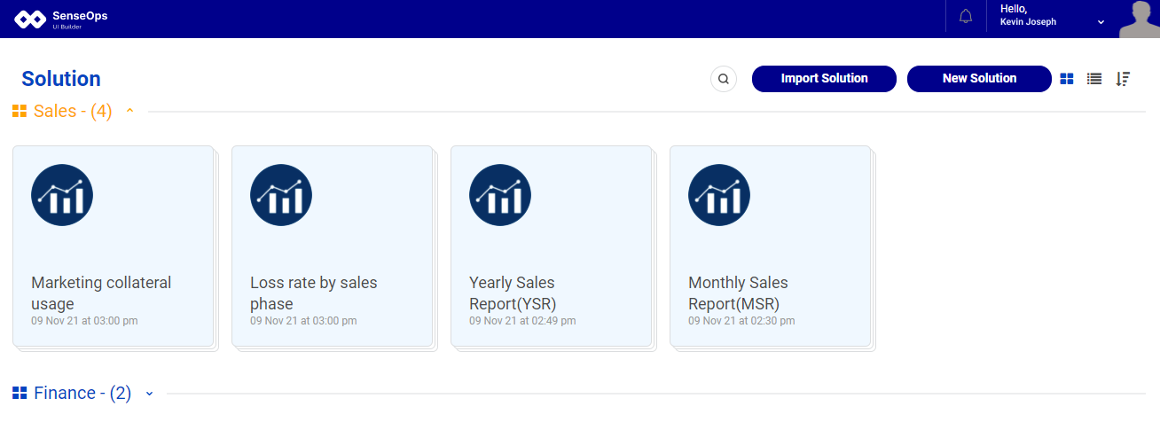
Once the users log in, they will be redirected to the solutions page. Here users can access the solutions they created or the solutions which have been shared with them based on the solution groups.
Basic operations
Users can create new solutions and update solution settings from the landing page.
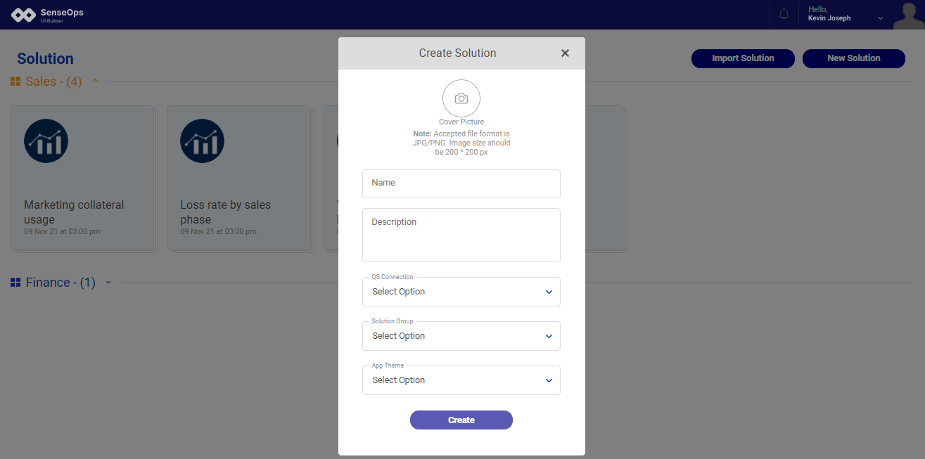
Create Solution
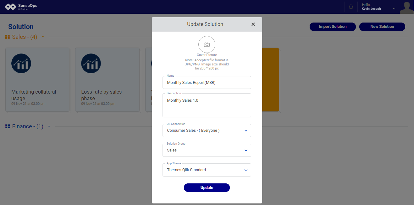
Click on the 'New Solution' to create a new solution. When the ‘New Solution’ button is clicked, a pop-up screen will appear where the users must fill in the mandatory details for solution creation.
● Solution cover picture

● Solution name

● Solution description

● QS Connection: Connects Qlik applications to the SenseOps UI Builder solution to configure the charts and KPIs in greater detail.

● Solution group: the solution group to which the newly created solution belongs. Solution group is nothing but what we have 'Streams' in Qlik Sense.

● App Theme: The users can set an inbuilt theme for the solution.
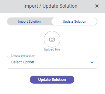
Import and update solution
There are two methods for importing the solution.
Import the solution as a newer version
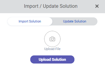
Import by overriding existing solution
General options
Users can perform basic operations like editing the solution, sharing it with internal users, exporting the entire solution, duplicating the solution, adding triggers to the solution, and deleting it.
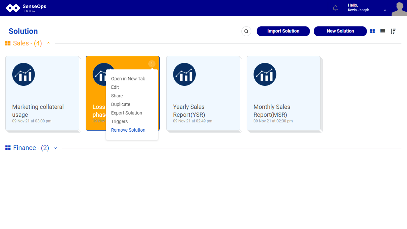
Edit Solution
The Edit option allows the users to make changes to the solution. The solution's name, app connection, and application theme can all be changed by the solution's owner. The QS Connection option will display all Qlik applications for you to choose from.
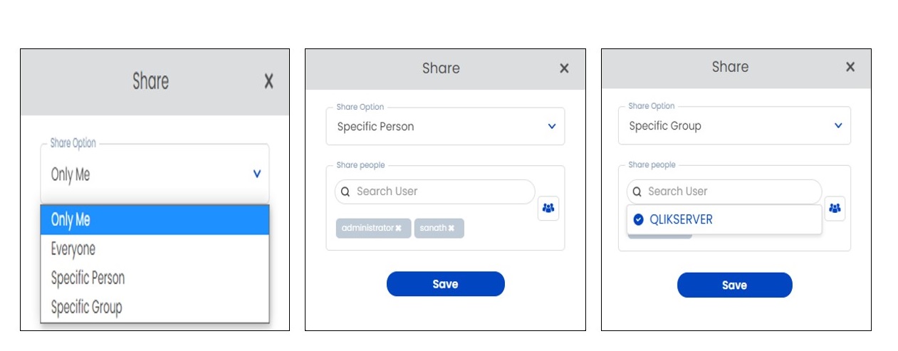
Share
Users will have the ability to share the solution using the choices below.
● Only Me - Because the solution is only visible to the creator, this option will be activated by default. Only the dashboard page shows which users have access and can do their tasks based on their authorization status. ● Everyone - The developed solution is shared with all other users, allowing the solution to appear in their dashboard. ● Specific Person - The developed solution can be shared with the users you choose, and a user list will appear on the screen for you to choose from.
Duplicate
The user can duplicate the board, and the name of the cloned board can be altered as per the users' needs.
Export Solution
Users can export the entire solution in 'GUI' format, which can be utilized in other environments where SenseOps UI Builder is installed.
Remove Solution
Users can permanently remove the solution using this option
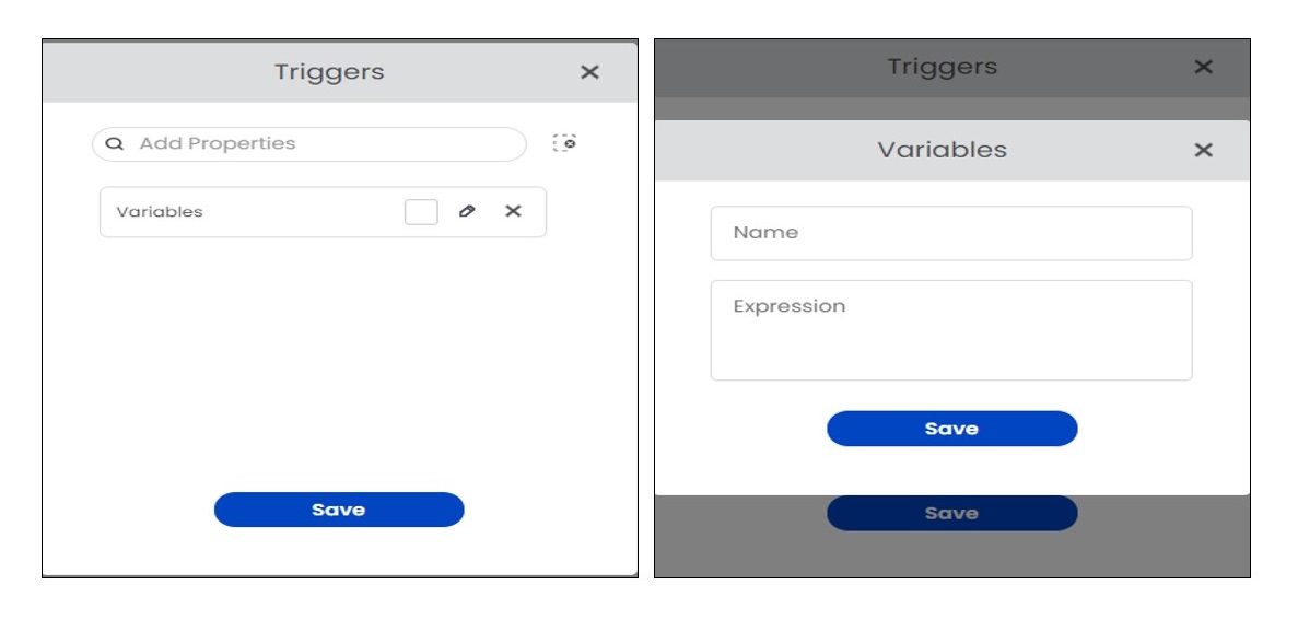
Triggers
This allows users to create triggers for the solution which fires when a defined event is occurred.
We have six different trigger settings to choose from the dropdown.
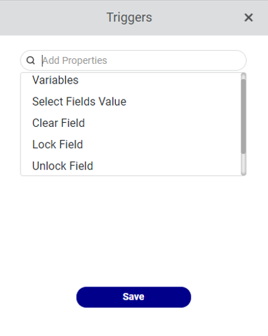
Variables
Users can define variables by selecting 'Variables' from the triggers dropdown. The name of the Qlik variable and an expression for the variable is defined, and the variable is reflected in the chart with which it is related. Users can click on 'edit' icon to edit variable name and expression.
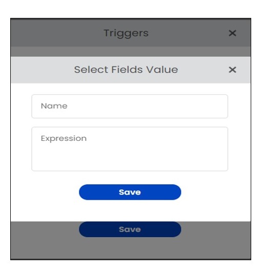
Select Field Value
The user can utilise this property to give a value to the field they've chosen.
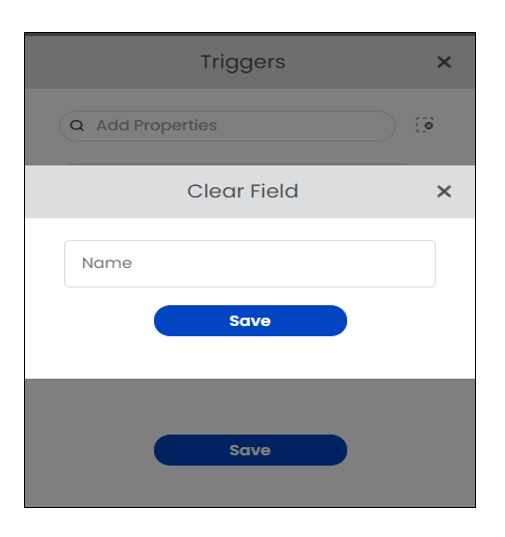
Clear
This property allows the user to clear the value of a selected field. Users can click on edit icon to set the field name that is to be cleared.
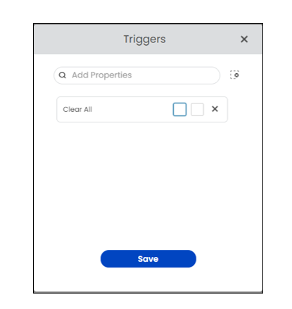
Clear all
Using this option, users can clear all the selected values.
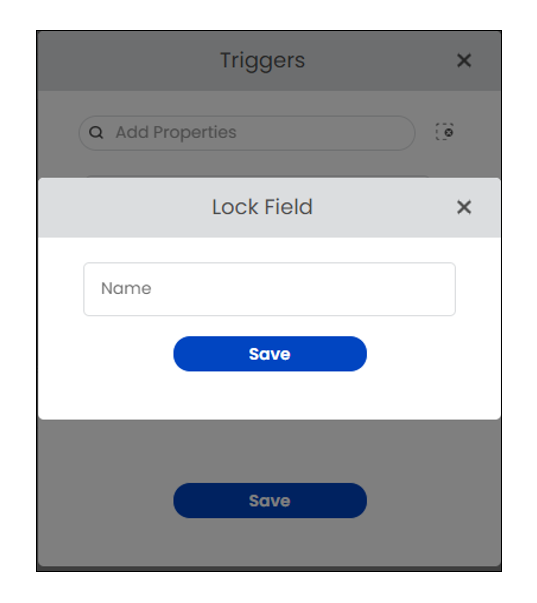
Lock
The users can use the Lock property to lock a field based on a Qlik trigger. Users can click on edit icon set field which is to be locked.
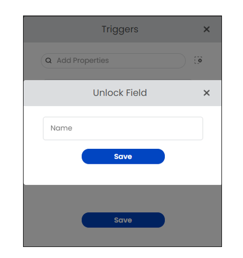
UnLock
Users can use this option to unlock fields depending on a Qlik trigger. Users can click on edit icon set field which is to be unlocked.
Solution UI settings
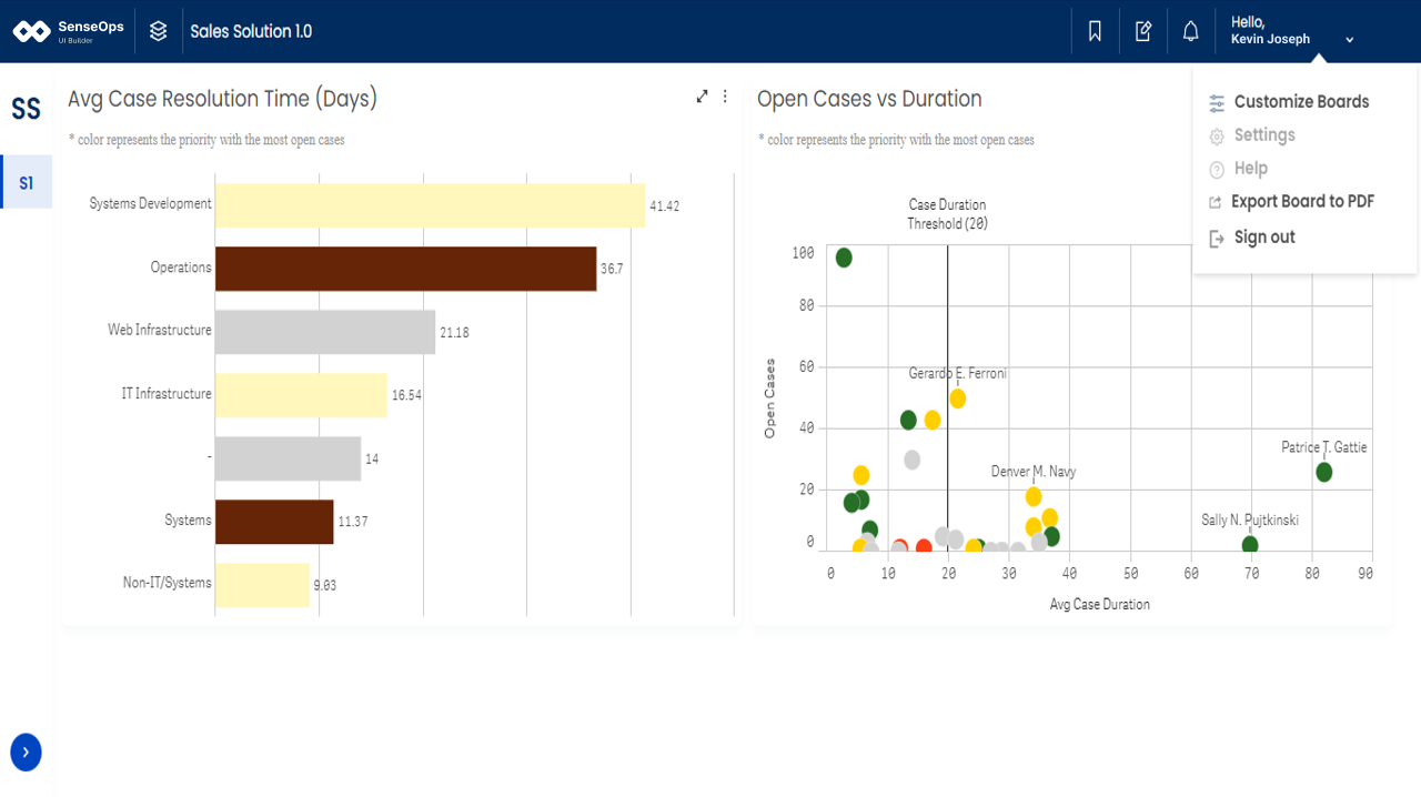
Users will have option to change the UI of the current solution using Solution UI Settings. When a solution is opened, users should click on 'Customize Boards' from the user profile which will redirect to the Customize Boards page.
Now from the user profile select the Settings option to open solution settings modal.
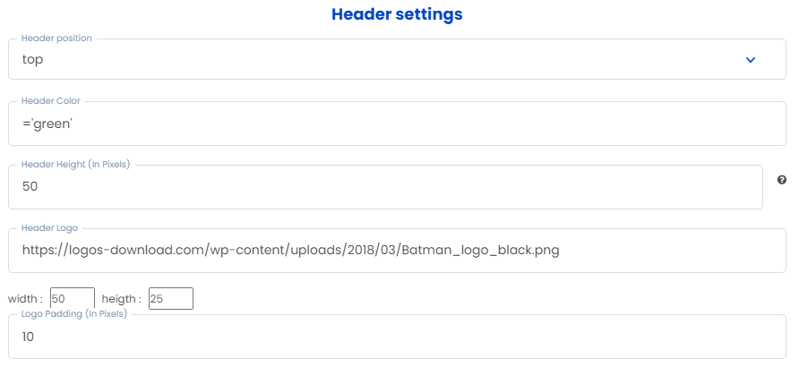
Header settings
Users can make changes to the Header of the current solution using 'header settings' in solution UI settings. Below are the options available to change the header's UI.
| SNo | Setting | Parameter type | Parameter example | Result |
|---|---|---|---|---|
| 1 | Header position | Dropdown | Top, Left | Header will align based on the user input(either top or left) |
| 2 | Header color | Qlik Expression | ='darkblue' | Header background color will change to the input given. |
| 3 | Header height | Number(in pixels) | 20, 40, 35,?tc | Header height will be adjusted according to the number of pixels given by the users |
| 4 | Header logo | Link/URL | https://logos-download.com/wp-content/uploads/2018/03/Batman_logo_black.png | Replaces the header logo with the one in the URL. |
| 5 | Logo width & logo height | Number(in pixels) | 20, 40, 35,?tc | Header logo width & height will be adjusted?ccording to the number of pixels given by the users |
| 6 | Logo Padding | Number(in pixels) | 20, 40, 35,?tc | Padding of the header logo will be adjusted?ccording to the number of pixels given by the users |
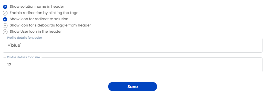
| 7 | Show solution name in header | Check/Uncheck | nan | Checked: Displays the?olution?ame in the header |
| 8 | Enable redirection by clicking the Logo | Check/Uncheck | nan | Checked:?nables redirection by clicking the Logo |
| 9 | Show icon for redirect to solution | Check/Uncheck | nan | Checked:?isplays icon for the redirect to the solution |
| 10 | Show icon for sideboards toggle from header | Check/Uncheck | nan | Checked:?isplays sidebar toggle icon in the header |
| 11 | Show User Icon in the header | Check/Uncheck | nan | Checked:?isplays user icon in the header |
| 12 | Profile details font color | Qlik Expression | ='#ffffff' | Font color of the user profile details will be changed as per color given by the users |
| 13 | Profile details font size | Number(in pixels) | 20, 40, 35,?tc | Font size of the user profile details will be changed as per the input. |
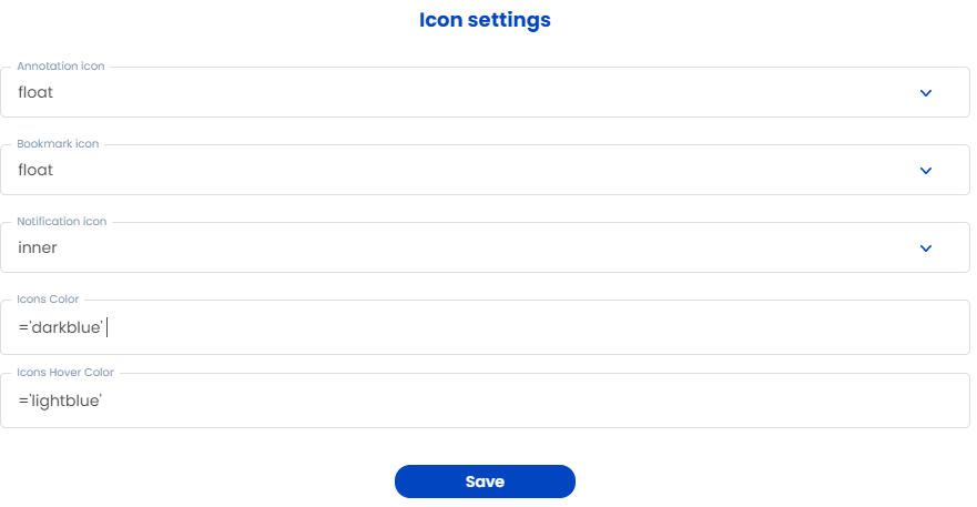
Icon settings
Users can changes the position and styles of notification, bookmark and annotation icons using icon settings.
| SNo | Setting | Parameter type | Parameter example | Result |
|---|---|---|---|---|
| 1 | Annotation icon | Dropdown | None, Float, Inner | None: Hides the icon,Float: Displays a floating annotation icon, Inner: Displays annotation icon at the top left of the header |
| 2 | Bookmark icon | Dropdown | None, Float, Inner | None: Hides the icon, Float: Displays a floating bookmark icon, Inner: Displays bookmark icon at the top left of the header |
| 3 | Notification icon | Dropdown | None, Float, Inner | None: Hides the icon, Float: Displays a floating notification icon, Inner: Displays notification icon at the top left of the header |
| 4 | Icons color | Qlik expression | ='darkblue' | Defines the color of notification, bookmark and annotation icons |
| 5 | Icons hover color | Qlik expression | ='lightblue' | Defines the color of notification, bookmark and annotation icons when hovered |
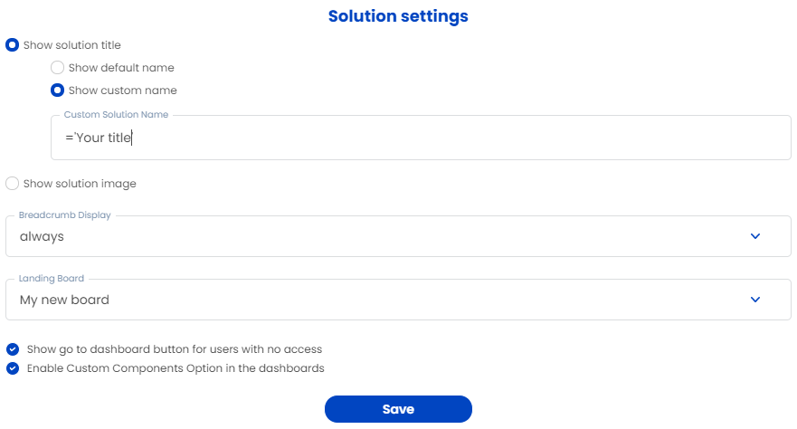
Solution settings
Users can configure solution title, solution image and more other properties.
| SNo | Main setting | Type | Sub setting | SubType | Parameter example | Result |
|---|---|---|---|---|---|---|
| 1 | Show solution title | Radio button | Show default name | Checkbox | No | Displays default solution name |
| 2 | Show solution title | Radio button | Show custom name | Text | Dummy solution | Displays custom name given by the users. |
| 3 | Show solution image | Radio button | Collapsed view | Qlik expression | your_link_here | Displays solution image when sidebar is collapsed |
| 4 | Show solution image | Radio button | Expanded view | Qlik expression | your_link_here | Displays solution image when sidebar is expanded |
| 5 | Breadcrumb display | Dropdown | No | No | None, Always, Child boards only | None: Hides the breadcrumb |
| 6 | Breadcrumb display | Dropdown | No | No | No | Always: Displays the breadcrumb at the top left of the header |
| 7 | Breadcrumb display | Dropdown | No | No | No | Child boards only: Displays only the child boards |
| 8 | Loading board | Dropdown | No | No | Lists all the available boards to select | Defines which board will display when user lands in solution |
| 9 | Show go to dashboard button for users with no access | Checkbox | No | No | Check/Uncheck | Checked: Displays dashboard view button for the users with no access |
| 10 | Show go to dashboard button for users with no access | Checkbox | No | No | No | Unchecked: Hides dashboard view button for the users with no access. |
| 11 | Enable Custom Components Option in the dashboards | Checkbox | No | No | Check/Uncheck | Checked: Enables users to add custom components to their dashboard |
| 12 | Enable Custom Components Option in the dashboards | Checkbox | No | No | No | Unchecked: Disables users from adding custom components to their dashboard |
Sidebar settings
Users can make changes to the Sidebar of the current solution using Sidebar settings in solution UI settings. Below are the options available to change the sidebar's UI.
| SNo | Setting | Parameter type | Parameter example | Result |
|---|---|---|---|---|
| 1 | Board list position | Dropdown | Top, Left | Board list will align based on the user input(either top or left) |
| 2 | Sidebar background color | Qlik Expression | darkblue | Sidebar background color will change to the input given. |
| 3 | Sidebar header text color | Qlik Expression | darkblue | Sidebar header color will change to the input given. |
| 4 | Sidebar board text color | Qlik Expression | darkblue | SIdebar text color will change |
| 5 | Sidebar board text font size | Number (in pixels) | 20, 40, 35 | Font size will be adjusted |
| 6 | Sidebar Board Hover and Active Text color | Qlik Expression | lightblue | Hover text color changes |
| 7 | Sidebar button color | Qlik Expression | aliceblue | Button color will change |
| 8 | Sidebar tooltip background color | Qlik Expression | skyblue | tooltip background color will change |
| 9 | Sidebar tooltip text color | Qlik Expression | darkblue | tooltip background color will change |
| 10 | Sidebar tooltip hover and active text color | Qlik Expression | darkblue | tooltip hover and active color will change |
| 11 | Sidebar tooltip text font size | Number(in pixels) | 20, 40, 35 | tooltip text fontsize will be adjusted |
Filter settings
Users can customize the filter theme, filter placement, and filter icon using filter settings.
Sub Header settings
Sub header serves the purpose of navigation in between the parent and child boards. And users can also configure buttons to navigate to previous/next boards.
| SNo | Tire-1Setting | Parameter type | Parameter example | Result |
|---|---|---|---|---|
| 1 | Background color | Qlik Expression | lightblue | Sets the background color of the sub header |
| 2 | Text color | Qlik Expression | darkblue | Sets the text color of the sub header text. |
| 3 | Text font size | Number(in pixels) | 10, 12, 20 | Sets the font size of the sub header text |
| 4 | Text alignment | Dropdown | Top, Bottom, Center | Sets the vertical alignment of the sub header text to top |
| 5 | Height | Number(in pixels) | 20, 40, 35 | Sets the height of the sub header as per the user input |
| 6 | Margin | Number(in pixels) | 20, 40, 35 | Sets the margin of the sub header as per the user input |
| 7 | Border radius | Number(in pixels) | 20, 40, 35 | Sets the roundness of the sub header as per the user input |
| 8 | Show board back and forward button | Checkbox | Check/Uncheck | Check: Enables buttons in the sub header to navigate back & forward and further enables settings for those buttons. |
Grid settings
Each chart on the dashboard has its own grid attributes which includes annotation visibility, grid header settings, export options, and hidden fields-related settings. Users can customize their grids using Grid settings.
| SNo | Setting | Parameter type | Parameter example | Result |
|---|---|---|---|---|
| 1 | Grid header color | Qlik Expression | ='lightblue' | Sets the background color of the grids |
| 2 | Grid header text color | Qlik Expression | ='darkblue' | Sets the text color of the grids |
| 3 | Padding between the grids | Number(in pixels) | 10, 12, 20 | Sets the padding inside the grids. |
| 4 | Show download icon | Checkbox | Check/Uncheck | Check: Enables download icon to download the particular grid/chart |
| 5 | Show three dot icon | Checkbox | Check/Uncheck | Check: Enables menu icon to which have options to create, view annotations and export to excel & pdf. |
| 6 | Show divider between sidebar and grid | Checkbox | Check/Uncheck | Check: Displays a thin line between sidebar and the grid |
| 7 | Show create and view annotation options in dropdown | Checkbox | Check/Uncheck | Check: Enables create & view annotation options in the menu |
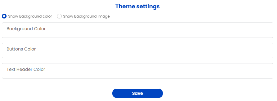
Theme settings
Users can customize their screen as per their needs with Theme settings.
| SNo | Setting | Parameter type | Parameter example | Result |
|---|---|---|---|---|
| 1 | Show background color | Radio button | Check uncheck | Check: User can define background color across the solution |
| 2 | Show background image | Radio button | Check uncheck | Check: User can add background image across the solution |
| 3 | Button's color | Qlik Expression | =$('darkblue') | Sets the button color across the solution |
| 4 | Text header color | Qlik Expression | =$('darkblue') | Sets the header text color across the solution |
Export settings
Users can configure grid export and board export buttons using Export settings option.
| SNo | Setting | Parameter type | Parameter example | Result |
|---|---|---|---|---|
| 1 | Show export pdf in the grid dropdown | Checkbox | Check, uncheck | Check: Enables export pdf option in the grid dropdown, Uncheck: Disables export pdf option in the grid dropdown |
| 2 | Show export to excel in the grid dropdown | Checkbox | Check, uncheck | Check: Enables Export to excel option in the grid dropdown, Uncheck: Disables export to excel option in the grid dropdown |
| 3 | Show export board to pdf option | Checkbox | Check, uncheck | Check: Enables export board to pdf option in the user profile dropdown, Uncheck: Disables export board to pdf option in the user profile dropdown |
Annotation settings
Users can customize, share or disable annotations using Annotation settings.
| S.No. | Settings | Type | Options | Description |
|---|---|---|---|---|
| 1 | Share option | Dropdown | Everyone, only me, Specific person | User can select whome to share the annotations with. |
| 2 | Share people | Dropdown | List of all available users | User can select multiple recipients to whom they wish to annotate and share |
| 3 | Enable audit log | Checkbox | Check ,uncheck | Check: Enables or Disable Audit log |