Straight Table
Introduction
This document provides comprehensive information about the Straight Table, accompanied by GIF graphics that demonstrate its usage in Qlik Sense.
*** Information on the Straight Table for Qlik Sense. ***
About Straight Table
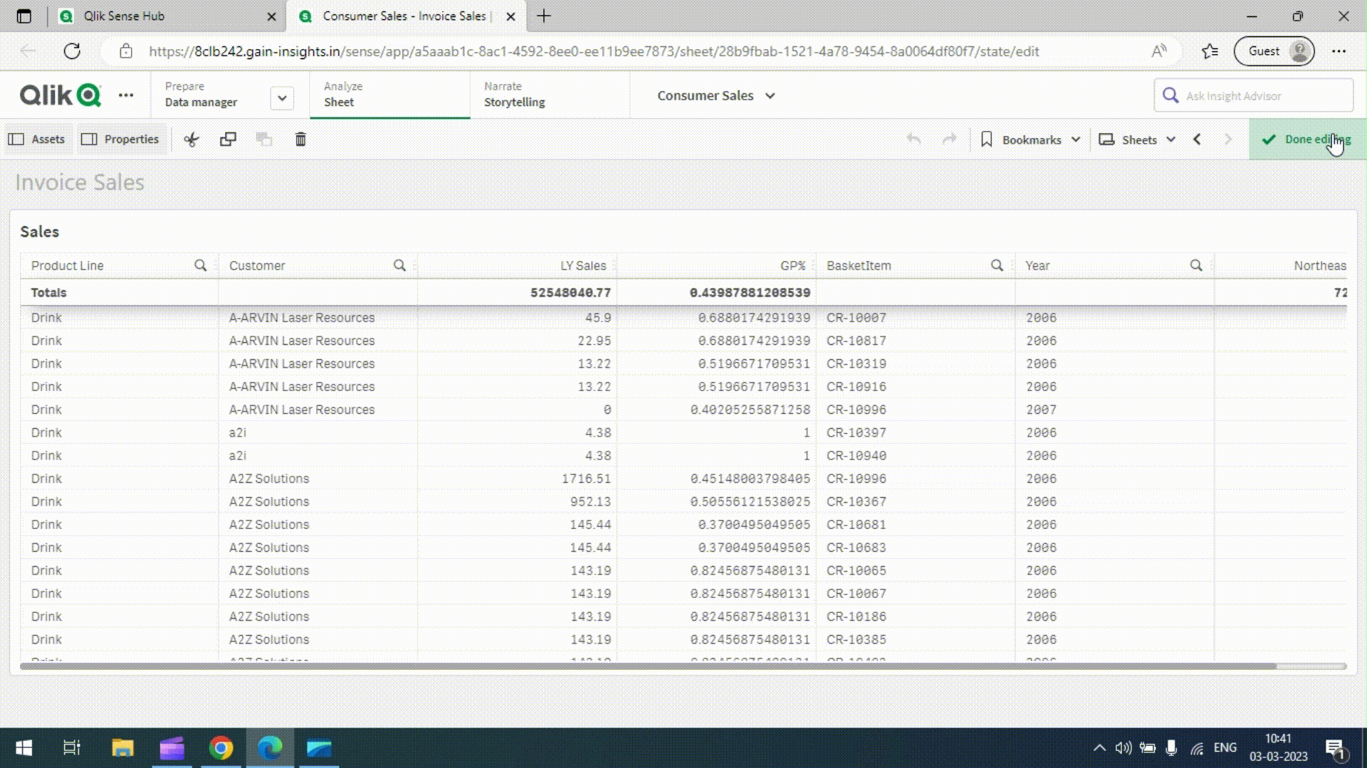
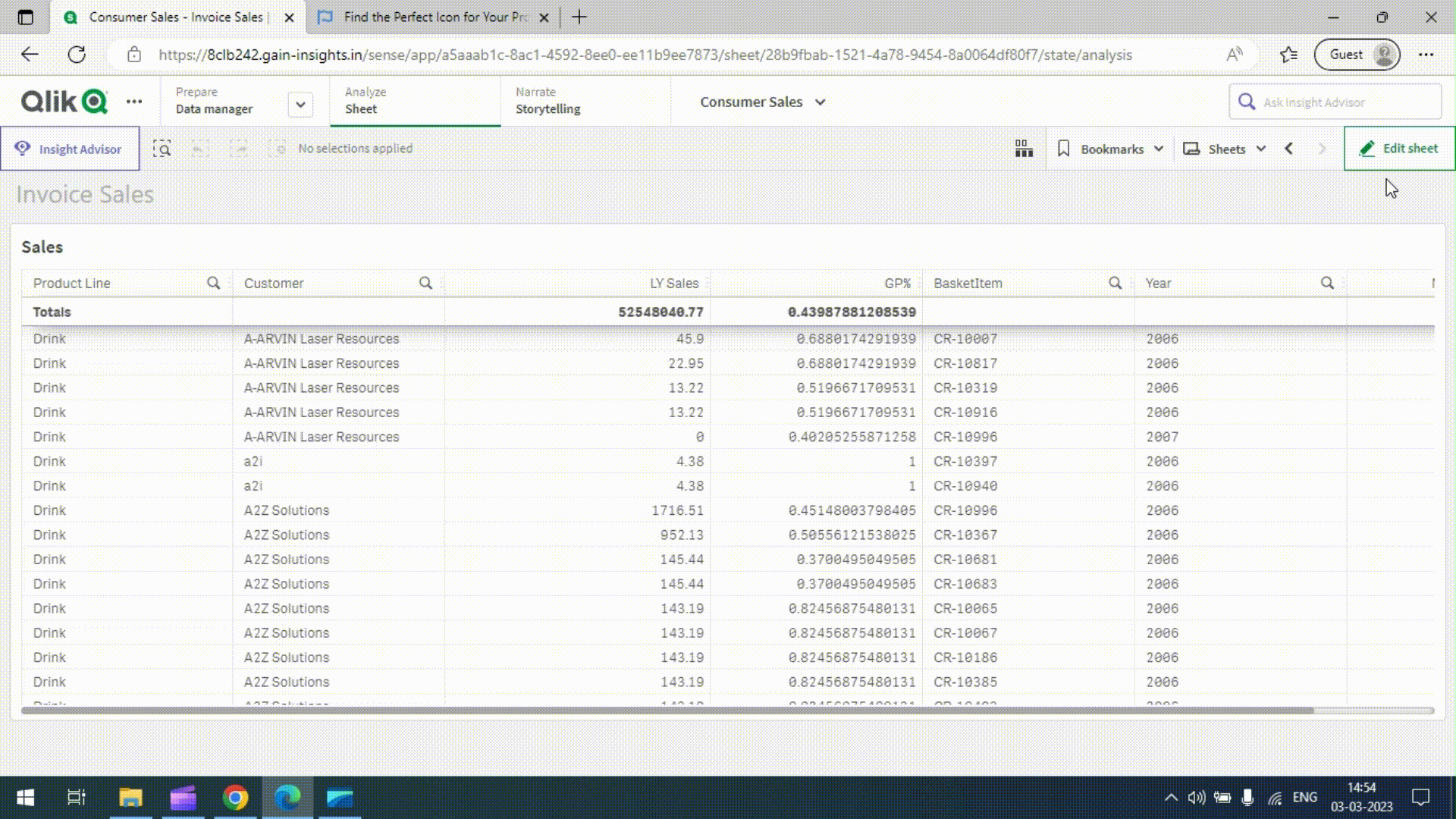
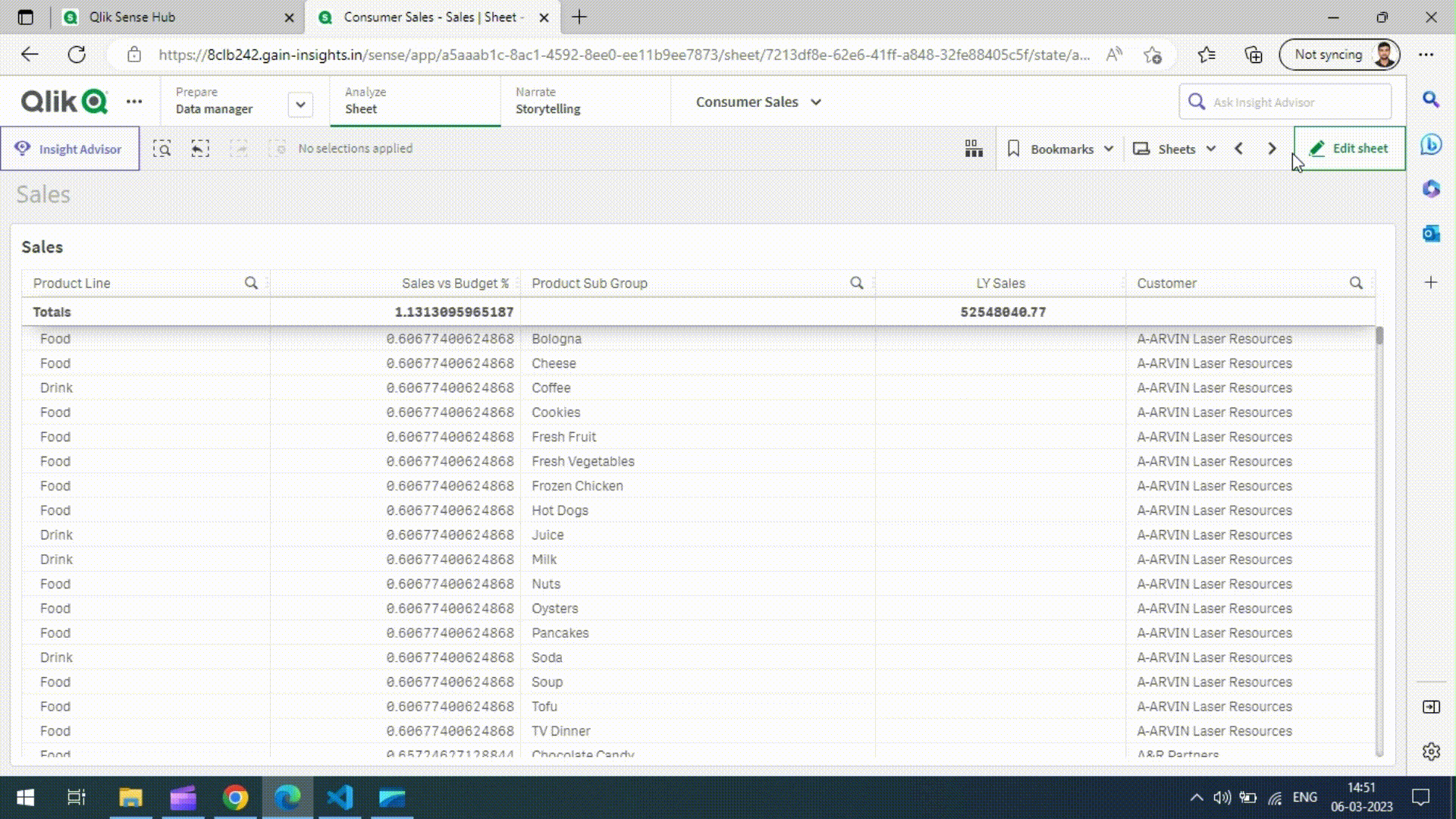
The Straight table is a user-friendly and efficient solution for generating Qlik Sense tables with large datasets. It offers on-demand data loading and scrolling, along with various features such as full color and alignment control, sparkline charts/micro charts on each line, full interactivity support, the ability to disable native functionality, header formatting, conditional show/hide of columns, and HTML support.
Guides - Setup Table Wizard
The Setup Table Wizard is accessed by clicking on the wizard icon within the table. It opens a popup screen with three tabs: Dimensions, Measures, and Fields. The screen also includes buttons for right-direction and left-direction layout, as well as cancel and create actions.
In the Dimensions tab, a list of dimensions is displayed. In the Measures tab, a list of measures is shown. The Fields tab provides a list of available fields, which can be filtered based on the table selection. The right-direction layout button copies selected items from the list to the table, while the left-direction layout button removes selected items. To reorder table columns, users can click and drag the draggable icon located at the end of the column list. Once all selections are made, clicking the Create button completes the setup process.
Guides - Creating a Table
Follow these steps to create a table in Qlik Sense using the Straight Table:
-
Open any Qlik Sense application and create a new sheet.
-
Go to the edit sheet and click on it.
-
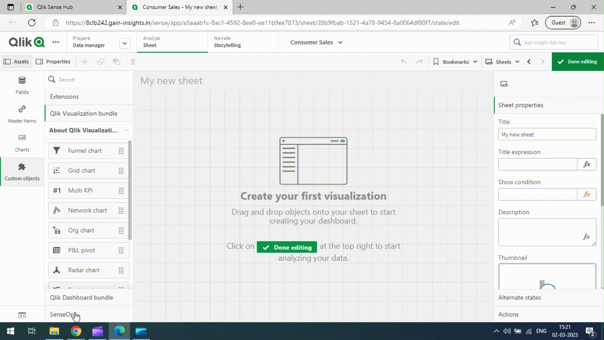
In the far-left panel, click on Custom Objects to open the custom objects menu.
-
Select SenseOps
-
Click and hold the cursor on Stretchd_Smart_Table, then drag and drop it onto the sheet.
-
Adjust the table sizes by dragging the table edges.
There are two methods to populate the table with data:
-
Table Wizard:
-
Click on the wizard icon inside the table to open the Table Wizard popup screen.
-
The popup screen consists of three tabs: Dimensions, Measures, and Fields.
-
Check the checkboxes next to the desired items in each tab.
-
Click the right-direction overlay button to add the selected items to the table.
-
To remove items, select them in the right-side list and click the left-direction overlay button.
-
Reorder table columns by clicking and dragging the cursor to the desired position.
-
Finally, click the Create button to generate the table based on the selected items.
-
-
Drag and Drop from Master Items:
-
In the far-left panel, click on Master items to open the Master items menu
-
To add master items, click and drag them from the menu onto the table.
-
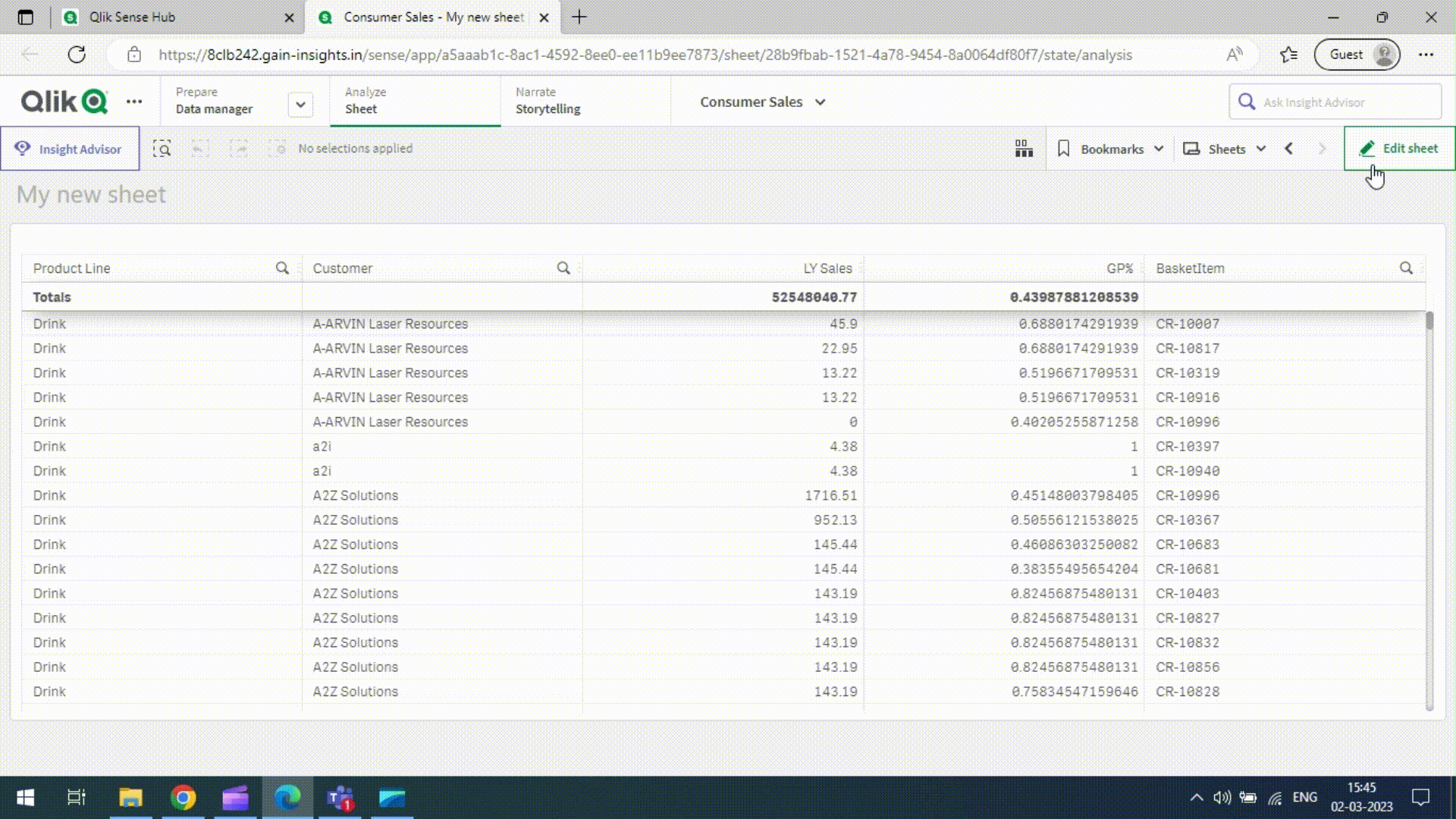
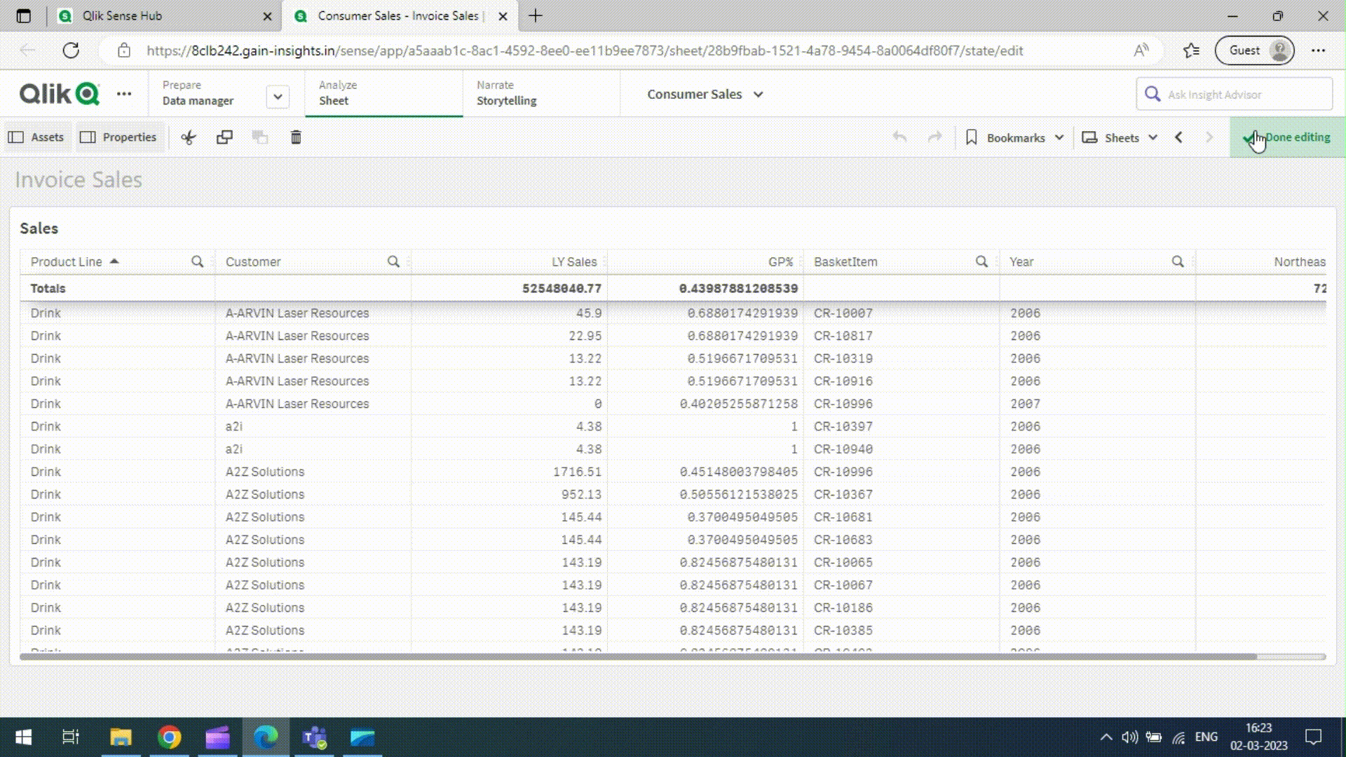
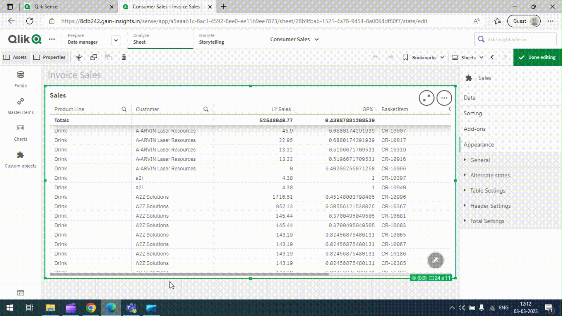
Once the table is created, users can adjust its appearance and other settings using the properties panel. For more detailed information, refer to the Properties Guide..
Properties - Data - Dimensions
You may customise the layout and formatting of Straight table.
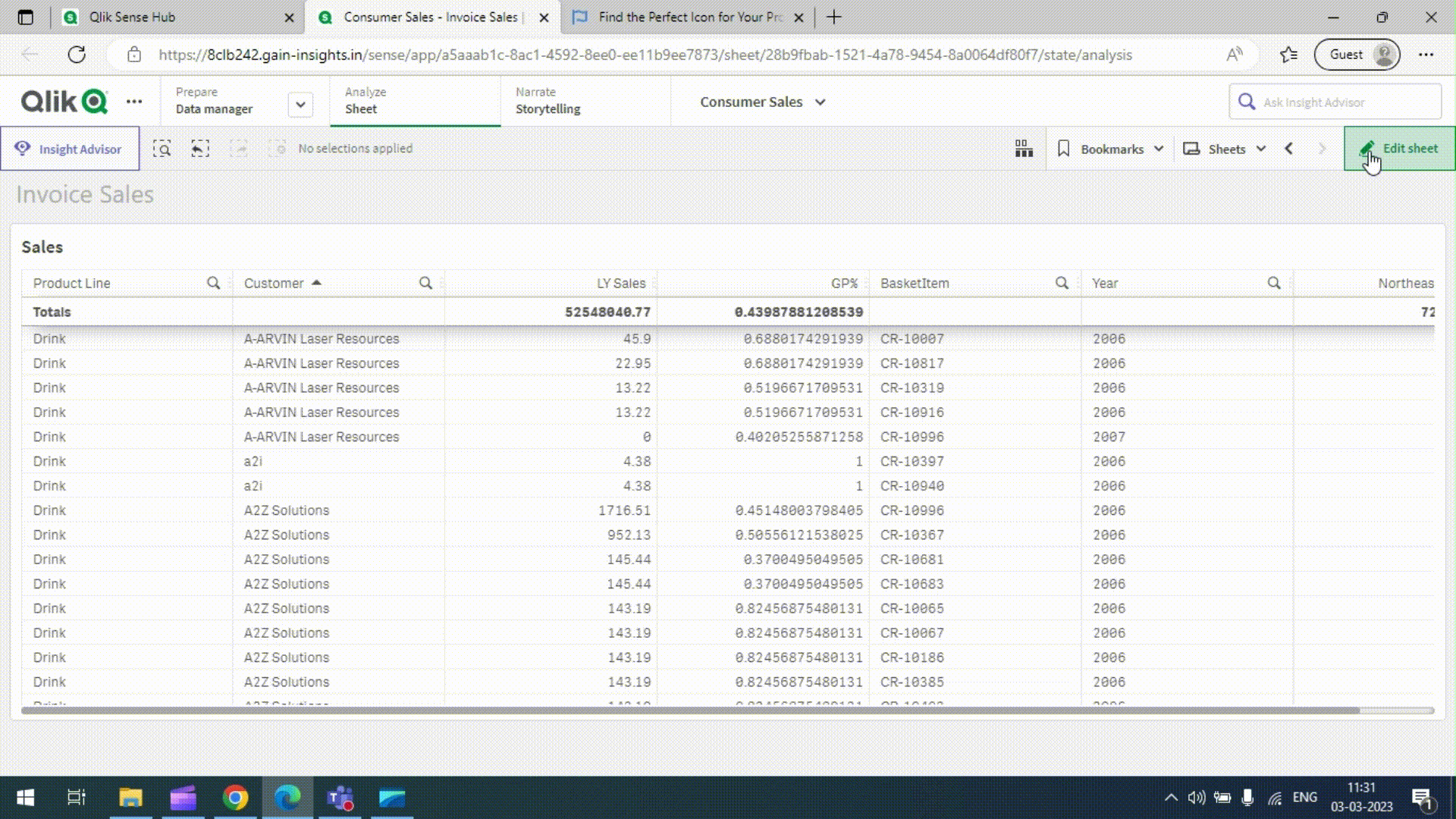
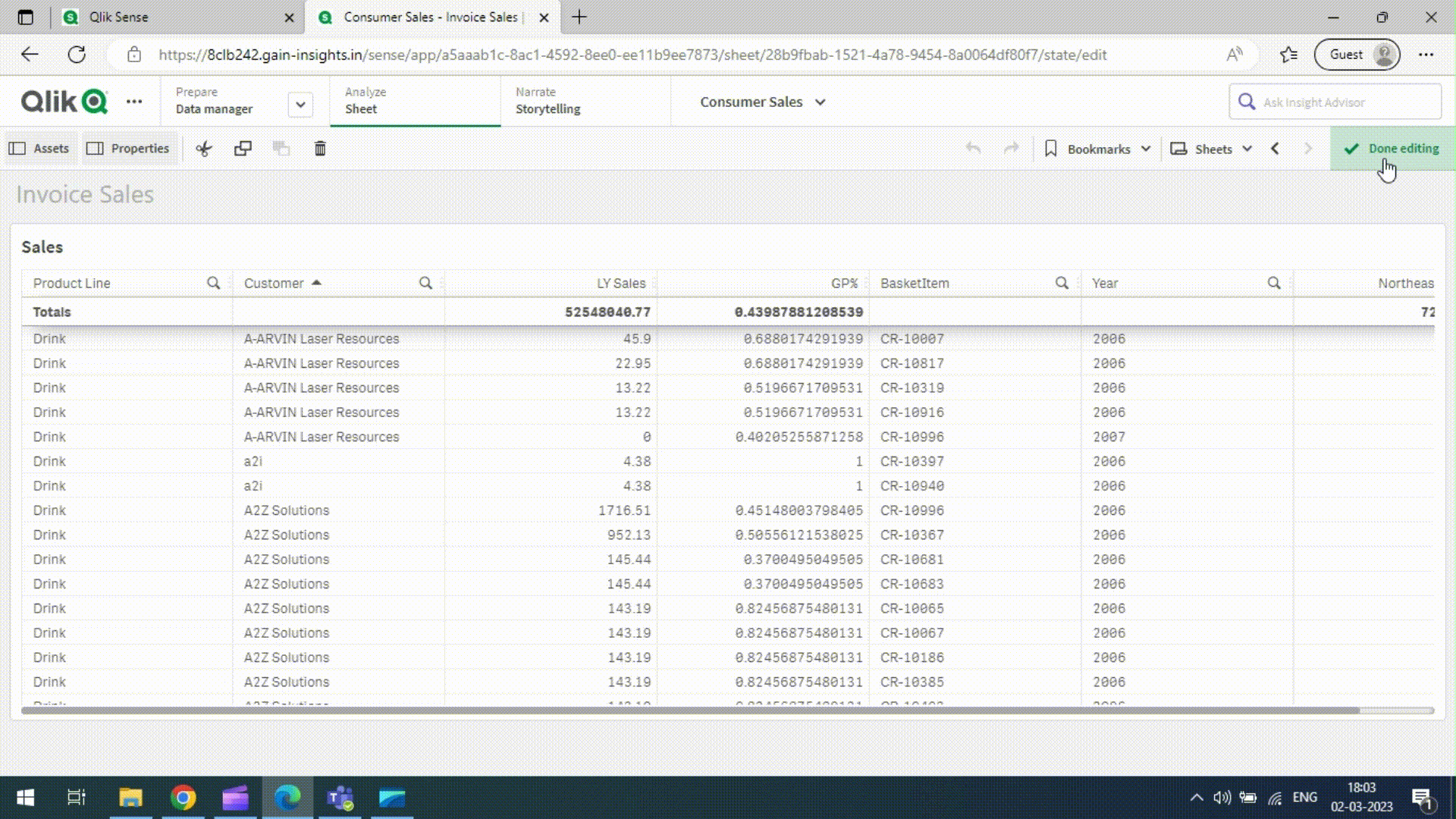
Clicking Edit sheet in the toolbar, then clicking the visualization you want to modify, brings up the properties panel for that particular visualization.
Default
Dimensions, Limitation,and Include null values are standard Qlik Sense functionalities. Refer to the Qlik Sense documentation for further details.
Columns
Show/Hide Column in UI: Show or hide the entire column in the table. Even if the column is hidden, it will still appear in the exported Excel file.
Column Width: Set the width of the columns in the table.
Wrap Text: Display cell contents on multiple lines for improved readability and fit.
Show search icon: Choose to display or hide the search icon in the header.
Enable column resize: Allow users to resize columns.
Text alignment: Align column data (center, left, or right)..
Cells
Cell Selection: Enable or disable cell interaction based on expressions.
Cell background color: Change the background color of specific cells, groups, or entire columns using expressions.
Cell font color: Modify the font color of specific cells, groups, or entire columns using expressions.
Cell Font Weight: Set the font weight for the entire column.
Cell Representation:
Customize cell display as text, link, indicator, image, mini chart, star ratings, or HTML element.
Header
Show Header Icon: Insert icons in the header for visual enhancement.
Inline header style: Customize individual header columns, including background color, font color, and representation.
Header Background Color: This option will give the background color to the header column cell.
Header Font Color: This option will give the font color to the header column cell.
Header Representation: This option is used to represent the header weather it is text or html element.
Total
Inline total style: Style the total column, including background color, font color, and representation.
Total Background Color: This option is used to give the color to the background in the total column cell.
Total Font Color: This option will give the font color to the total column cell.
Total Representation: This option is used to represent the Total column weather it is text or html element.
Others
Tooltip: Customize the tooltip based on objects or HTML elements.
Add Action: Define actions to be performed when users navigate to the sheet.we have actions like Clear All, Clear field, Lock All, Lock Field, Unlock All, Unlock field, Apply Bookmark, and set variable
Properties - Data - Measures
Default
Measure, and Master measuring formatting features are part of the standard Qlik sense functionalities. For further details, see the Qlik sense documentation.
Columns
Show/Hide column in UI: This option is used to show or hide the entire column in the table and if the column is hidden still, we can see the column in the export to the excel
Column Width: This option helps to set the width of the column in the tables
Wrap Text: When this option is chosen, to displaying the cell contents on multiple lines, rather than one long line. This will allow you to avoid the "truncated column" effect, make the text easier to read and better fit in the column
Show Total: When this option selected the total cell of the Particular cell data will disapper in the table
Enable column resize: When this option is selected, the user has the ability to resize the column
Text alignment: This option is used to align the column data according to the selection; the user can choose whether to center, align left, or align right to display the content
Cells
Cell Selection: Cell Selection option will enable or disable the cell interaction based upon the expression
Cell background color: This option is used to change the background color of particular cell or group of cells or complete column by using the expression
Cell font color: This option is used to change the font color of particular cell or group of cells or complete column by using the expression
Cell Font Weight: This option is used to sets complete column text font weight
Cell Representation: All of these options will be personalised just for cells.
- When set to Text, all values are displayed as static text
- When set to Link, values that contain a URL are displayed as clickable links. Clickable links open a new browser tab. Users select a Link setting; either Add label or Add URL. When you set a link setting, only the corresponding option will be displayed
- When set to Indicator, then we have to set the Icon type Brands or Solid type
- Icon type is set to Brands, The user must enter an icon name from the Font Awesome Icons and, if necessary, set properties such as icon colour, icon position, and show values customization.
- Icon type is set to Solid, The user must enter an icon name from the Font Awesome Icons and, if necessary, set properties such as icon colour, icon position, and show values customization.
- When the Image option is selected, the user must provide the Image URL if necessary, as well as set parameters such as Image Shape, Image Height, Image Width, Show Values, and Image Position.
- When user set Mini Chart option then he must give the Mini Chart Dimension value and Chart type like bar or line based upon the chart type selections customize options will come.
- When user set to Star Ratings option then if he needs he can set the count of the stars, Stars size, Background color, and Fill color.
- When user set to HTML Element option then he must give the html object in the HTML Element fx text box.
Header
Show Header Icon: This option is used to insert the icon in the header, all the icons from the font awesome icons.

Inline header style: This option will specific only the particular header column and if user selected this option, following options will enable.
Header Background Color: This option will give the background color to the header column cell.
Header Font Color: This option will give the font color to the header column cell.
Header Representation: This option is used to represent the header weather it is text or html element.
Total
Inline total style: This option will style the total in the column, if user selected this option, following options will enable.
Total Background Color: This option is used to give the color to the background in the total column cell.
Total Font Color: This option will give the font color to the total column cell.
Total Representation: This option is used to represent the Total column weather it is text or html element.
Others
Tooltip: Initially, this option is in the basic mode, however, if you need to customize it, click on the toggle button and it will convert to the custom tooltip, then, we must select the tooltip representation, whether it is an object or an HTML element, and then we can customize the tooltip based on the selection.
Add Action: You can add one or more actions to be performed when users navigate to the sheet. For some actions, you need to provide details for the action.we have actions like Clear All, Clear field, Lock All, Lock Field, Unlock All, Unlock field, Apply Bookmark, and set variable
Properties - Sorting, Data Handling
All of these features are part of the standard Qlik sense functionalities. For further details, see the Qlik sense documentation.
Properties - Appearance
General, and Alternate states features are part of the standard Qlik sense functionalities. For further details, see the Qlik sense documentation.

Tables
Table Settings: The following options available to customized the table using the Table settings they are Table Row Heigh, Table font size, Font Family, Table Font Weight, Highlight rows on hover, Table Stripe, Enable multiple cell selection, Shadow for header and total, and Custom Row border.
Header
Header Settings: The table header can be customized using the Header settings. The following options are available in the Header settings they are Header Height, Header font size, Header Wrap, Header Background Color, Header Font Color, Font Family, Header Font Weight, Header Style, Custom Header border.
Total
Total Settings: The following options available to customized the Total row using the Total settings they are Total (Show/Hide), Total Row Height, Total Position, Total Background Color, Total Font Color , Font Family, Total Font Weight, and Custom Total border.